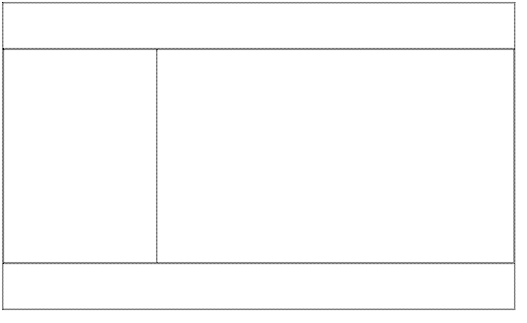
cat imagesize:300x200
<!DOCTYPE html>
<html lang="en">
<head>
<meta charset="UTF-8">
<title>Document</title>
<style>
*{box-sizing: border-box;}
div{border: 1px solid black;}
.wrapper{
margin: auto;
position: relative;
}
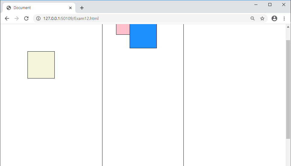
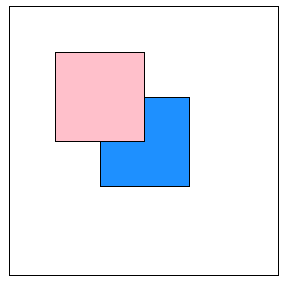
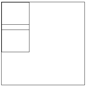
.box1{
width:300px;
height: 200px;
position: absolute;
top: 270px;
left: 350px;
}
.box2{
width:300px;
height: 200px;
position: absolute;
top: 150px;
left: 200px;
z-index: 1;
}
.box3{
width:300px;
height: 200px;
position: absolute;
top: 100px;
left: 400px;
z-index: 2;
}
.cat1{
width:100%;
height: 100%;
}
.cat2{
width:100%;
height: 100%;
}
.cat3{
width:100%;
height: 100%;
}
.txt{
background-color: white;
text-align: center;
font-size: 20px;
font-weight: bold;
}
</style>
</head>
<body>
<div class="wrapper">
<div class="box1">
<img src="cat1.jpg" class="cat1">
<div class="txt">Cat 1</div>
</div>
<div class="box2">
<img src="cat2.jpg" class="cat2">
<div class="txt">Cat 2</div>
</div>
<div class="box3">
<img src="cat3.jpg" class="cat3">
<div class="txt">Cat 3</div>
</div>
</div>
</body>
</html>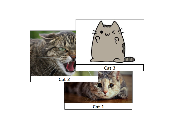
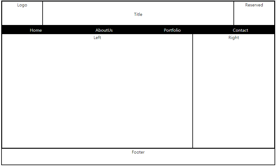
사이드 메뉴바 만들기
추가한 코드
            .sidemenu{
                border: 1px solid black;
                width: 100px;
                height: 200px;
                position: fixed;
                top: 300px

            }

            .smenu>li{
                list-style: none;
                width:100%;
                text-align: center;
                background-color: black;
                line-height: 50px;
            }
            .smenu>li>a{
                color: white;
                text-decoration: none;
            }
            .smenu>li:hover{
                background-color: dimgray;
            }
<div class="sidemenu">
<ul class="smenu">
<li><a href="#">Home</a></li>
<li><a href="#">AboutUs</a></li>
<li><a href="#">Portfolio</a></li>
<li><a href="#">Contact</a></li>
</ul>
</div>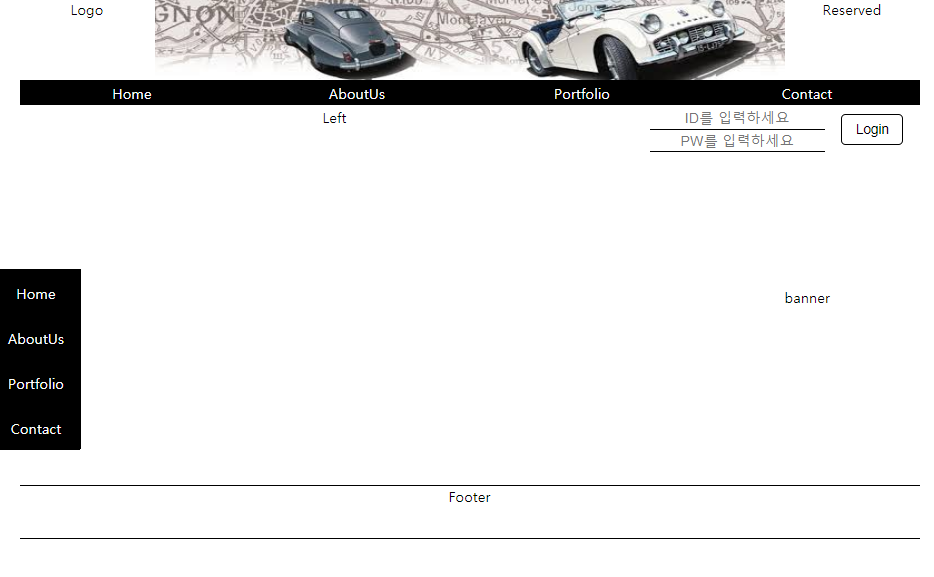
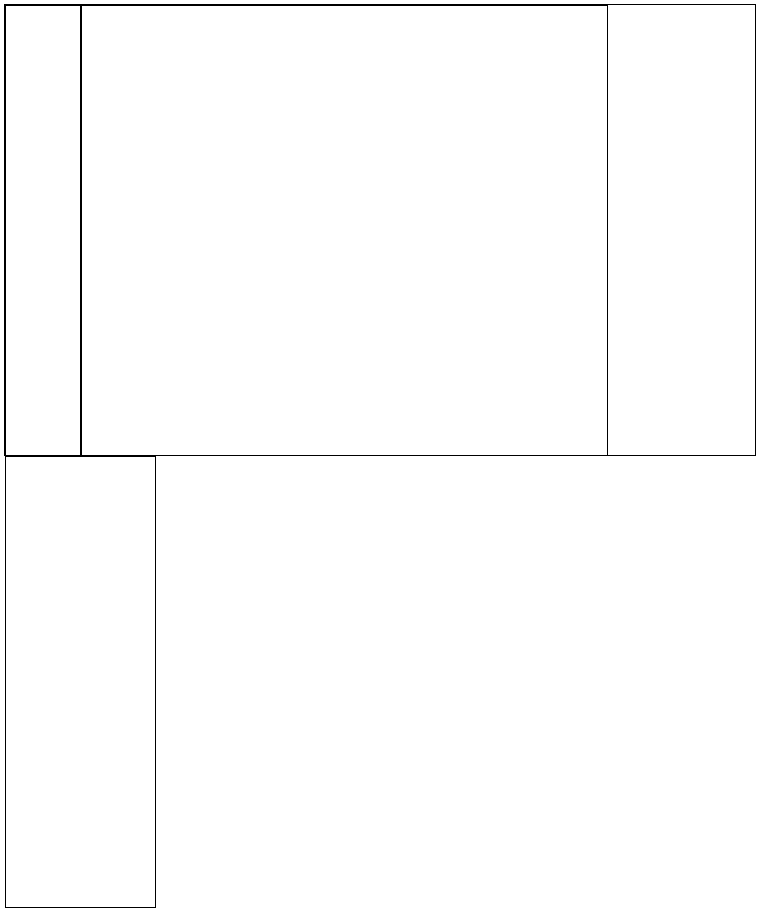
전체코드
더보기
<!DOCTYPE html>
<html lang="en">
<head>
<meta charset="UTF-8">
<title>Document</title>
<style>
*{
box-sizing: border-box;
margin: auto;
text-align: center;
padding: 0px;
}
div{
/* border: 1px solid black;*/
}
.wrapper{
width: 1000px;
height: 600px;
}
.sidemenu{
border: 1px solid black;
width: 100px;
height: 200px;
position: fixed;
top: 300px
}
.smenu>li{
list-style: none;
width:100%;
text-align: center;
background-color: black;
line-height: 50px;
}
.smenu>li>a{
color: white;
text-decoration: none;
}
.smenu>li:hover{
background-color: dimgray;
}
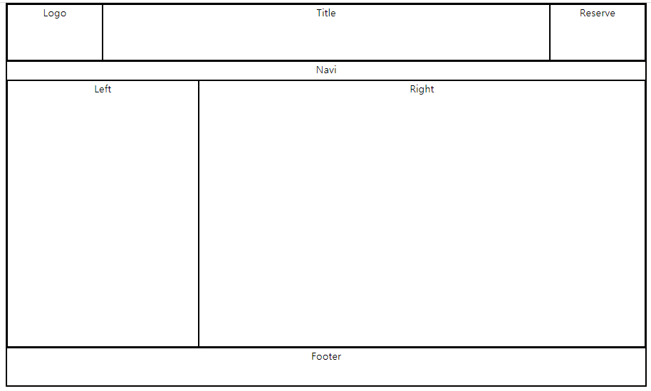
.header{height: 15%;}
.naviline{height: 5%;}
.navi{
height: 100%;
}
.contents{height: 70%;}
.footer{
height: 10%;
border-bottom: 1px solid black;
border-top: 1px solid black;
}
.left{
width: 70%;
}
.right{
width: 30%;
}
.header>.layout{
height: 100%;
float: left;
}
.logo{width: 15%;}
.title{
width: 70%;
line-height: 90px;
}
.reserve{width: 15%;}
.contents>.layout{
height: 100%;
float: left;
}
.navi>li{
float:left;
list-style: none;
width:25%;
text-align: center;
background-color: black;
line-height: 28px;
/* px 말고 %로는?*/
}
.navi>li>a{
color: white;
text-decoration: none;
/*width: 100%;*/
/*인라인 속성이라 넓이 조절 불가*/
display: block;
}
.navi>li:hover{
background-color: dimgray;
}
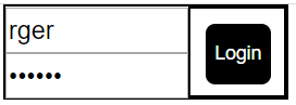
.idpw{
float: left;
height: 100%;
width:65%;
}
.idpw>.idbox{
height: 50%;
}
.idpw>.pwbox{
height: 50%;
}
.id{
width:100%;
height: 100%;
font-size: 100%;
border: none;
border-bottom: 1px solid black;
}
.pw{
width:100%;
height: 100%;
font-size: 100%;
border: none;
border-bottom: 1px solid black;
}
.login{
float: left;
width:35%;
height: 100%;
padding: 8px 8px;
}
.button{
border: 1px solid black;
background-color: white;
color: black;
border-radius: 5px;
padding: 8px 15px;
font-size: 15px;
}
.loginbox{
width: 100%;
height: 50px;
}
.banner{
padding: 150px
}
</style>
</head>
<body>
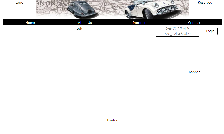
<div class="wrapper">
<div class="header">
<div class="logo layout">Logo</div>
<div class="title layout">
<img src="car2.jpg" width=100% height=100%>
</div>
<div class="reserve layout">Reserved</div>
</div>
<div class="naviline">
<ul class="navi">
<li><a href="#">Home</a></li>
<li><a href="#">AboutUs</a></li>
<li><a href="#">Portfolio</a></li>
<li><a href="#">Contact</a></li>
</ul>
</div>
<div class="contents">
<div class="left layout">Left</div>
<div class="right layout">
<div class="loginbox">
<div class="idpw">
<div class="idbox">
<input type="text" class="id" placeholder="ID를 입력하세요">
</div>
<div class="pwbox">
<input type="password" class="pw" placeholder="PW를 입력하세요">
</div>
</div>
<div class="login">
<input type="button" value="Login" class="button">
</div>
</div>
<div class="banner">
banner
</div>
</div>
</div>
<div class="footer">Footer
</div>
</div>
        <div class="sidemenu">
            <ul class="smenu">
                <li><a href="#">Home</a></li>
                <li><a href="#">AboutUs</a></li>
                <li><a href="#">Portfolio</a></li>
                <li><a href="#">Contact</a></li>
            </ul>
        </div>
</body>
</html>
'디지털 컨버전스 > HTML&CSS' 카테고리의 다른 글
| [CSS] 수직 정렬 - transform:translate() (0) | 2020.04.07 |
|---|---|
| [CSS] Transform (0) | 2020.04.07 |
| [CSS] Positioning - position: fixed (0) | 2020.04.07 |
| [CSS] z-index (0) | 2020.04.07 |
| [CSS] Positioning - position: absolute (0) | 2020.04.07 |