선택자 우선순위
!important > ID > CLASS > TAG
Inline CSS > Internal CSS > External CSS
ID선택자보다 인라인 스타일이 강력
CSS의 특성상 어떤 태그에 속성이 중복되어 설정될 수 있는데요,
CSS는 어떤 속성이 우선되어 적용되는지 미리 명시하고 있습니다.
우선순위는 아래와 같습니다.
- 속성 값 뒤에 !important 를 붙인 속성
- HTML에서 style을 직접 지정한 속성
- #id 로 지정한 속성
- .클래스, :추상클래스 로 지정한 속성
- 태그이름 으로 지정한 속성
- 상위 객체에 의해 상속된 속성
같은 우선 순위에 있는 경우, 부모-자식 관계가 많은 경우가 우선되며, 모든 설정이 같은 경우 나중에 선언한 것이 우선되어 적용됩니다.
동일한 선택자로 다른 스타일을 입히는 경우
나중에 적용되는 스타일이 덮어쓰기 한다.
<!DOCTYPE html>
<html lang="en">
<head>
    <meta charset="UTF-8">
    <title>Document</title>
    <style>
        div{
            border:1px solid green ;
        }
        div{
            border:1px solid blue ;
        }
    </style>
</head>
<body>
    <div id=A class=B></div>
</body>
</html>
CSS Optimizer 로 최적화 하기
Layout 구성하기
웹페이지 Layout 구성 주요 태그 : DIV / SPAN
CSS는 display 속성을 가진다
block속성 : 무조건 한 줄을 독차지(넓이값 100%)
width와 height 조정이 가능
대표 태그 : div
inline속성 : 자신이 가진 내용만큼의 넓이만 가짐
width / height 조정이 불가
대표 태그 : span
<!DOCTYPE html>
<html lang="en">
<head>
    <meta charset="UTF-8">
    <title>Document</title>
    <style>
        div{
            border:1px solid black;
            width: 100px;
            height: 100px;
        }
/*       div의 기본값: 높이 0 , 넓이 브라우저100%*/
/*       CSS는 display 속성을 가진다
        block속성 : 무조건 한 줄을 독차지(넓이값 100%)
                width와 height 조정이 가능
                대표 태그 div
                (자신의 넓익와 상관없이 자신이 가진 줄들을 독차지)
        inline속성 : 자신이 가진 내용만큼의 넓이만 가짐
                    width / height 조정이 불가
                    대표 태그 span*/
        span{
            border:1px solid red;
            width: 100px;
            height: 100px;
        }
/*        span : 넓이 0 , 높이*/
    </style>
</head>
<body>
<!--    웹페이지 Layout 구성 주요 태그 : DIV / SPAN-->
    <div>ABC</div>
    <div>DEF</div>
    <span>ABC</span>
    <span>DEF</span>
</body>
</html>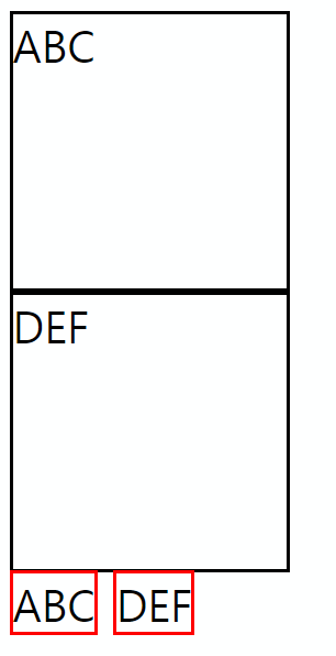
<!DOCTYPE html>
<html lang="en">
<head>
    <meta charset="UTF-8">
    <title>Document</title>
    <style>
        div{
            border:1px solid black;
            width: 100px;
            height: 100px;
/*          display:block; 기본값*/
            display:inline;
        }
        span{
            border:1px solid red;
            width: 100px;
            height: 100px;
/*          display:inline; 디폴트*/
            display:block;
        }
    </style>
</head>
<body>
    <div>ABC</div>
    <div>DEF</div>
    <span>ABC</span>
    <span>DEF</span>
</body>
</html>
span을 사용하는 경우 display:inline-block을 쓰고 공백을 지운다.
<!DOCTYPE html>
<html lang="en">
<head>
    <meta charset="UTF-8">
    <title>Document</title>
    <style>
        div{
            border:1px solid black;
            width: 100px;
            height: 100px;
        }
        span{
            border:1px solid red;
            width: 100px;
            height: 100px;
            display:inline-block;
        }

    </style>
</head>
<body>
    <div>ABC</div>
    <div>DEF</div>
    <span>ABC</span>
    <span>DEF</span>
</body>
</html>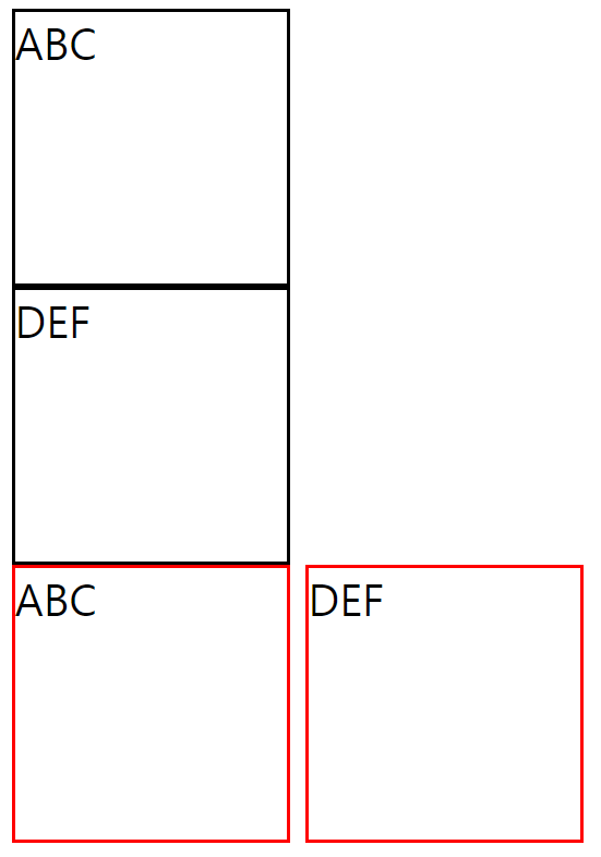
div에서 행방향으로 나누기는 쉽다
<!DOCTYPE html>
<html lang="en">
    <head>
        <meta charset="UTF-8">
        <title>Document</title>
        <style>
            div{
                border: 1px dotted black;
            }
            #warpper{
                margin: auto;
                width: 1000px;
            }
            #header{
                height: 100px;
            }
            #contents{
                height: 300px;
            }
            #footer{
                height: 100px
            }

        </style>
    </head>
    <body>
        <div id=wrapper>
            <div id=header>Header</div>
            <div id=contents>Contents</div>
            <div id=footer>Footer</div>
        </div>
    </body>
</html>
div를 사용하여 열방향 분할하기
<!DOCTYPE html>
<html lang="en">
    <head>
        <meta charset="UTF-8">
        <title>Document</title>
        <style>
            div{
                width:100px;
                height:100px;
                border: 1px solid black;
            }
            #box1{
                float: left;
            }
        </style>
    </head>
    <body>
        <div id ="box1">1</div>
        <div id ="box2">2</div>
<!--Nomal Flow : Tag를 작성했을 때 기본적으로 Element가 놓여지는 평면-->
    </body>
</html>
Nomal Flow : Tag를 작성했을 때 기본적으로 Element가 놓여지는 평면
float area에서는 block속성이 적용되지 않음
원래 float의 목적은 아니지만 해키한 효과.
문제 발생 : float를 사용했는데 원하는 결과가 아님
<!DOCTYPE html>
<html lang="en">
<head>
    <meta charset="UTF-8">
    <title>Document</title>
    <style>
        div{
            border: 1px solid black;
            float: left;
        }
        #wrapper{
            margin: auto;
            width:1000px;
            height:600px;
        }
        #left{
            width:10%;
/*            부모의 10% - 1000px의 10%, 100px*/
            height: 100%;
        }
        #center{
            width:70%;
            height: 100%;
        }
        #right{
            width:20%;
            height: 100%;
        }
    </style>
</head>
<body>
    <div id="wrapper">
        <div id="left"></div>
        <div id="center"></div>
        <div id="right"></div>
    </div>
</body>
</html>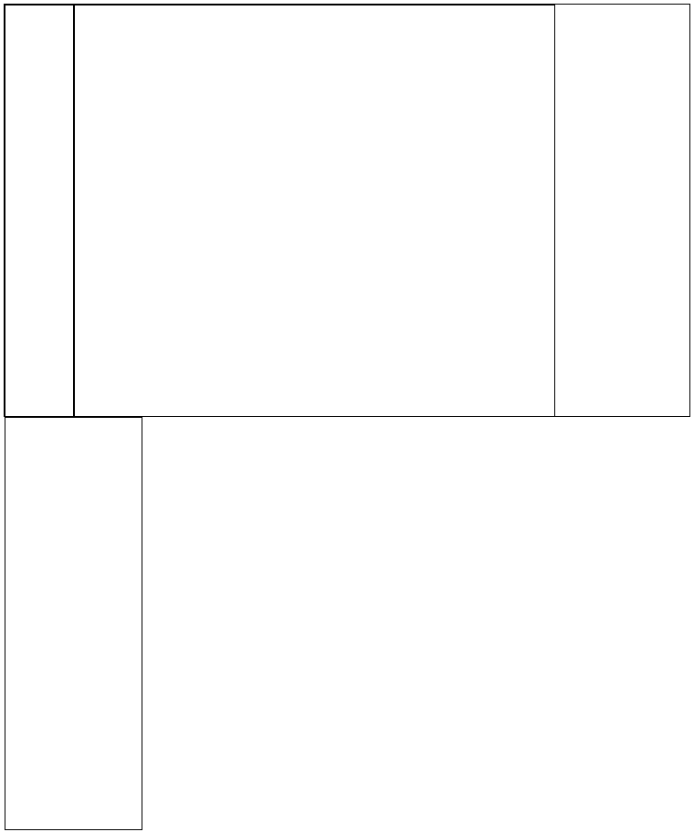
테두리가 1px을 차지
width 내부 영역 + 테두리 바깥px
1) 레이아웃 잡을 때마다 테두리*2만큼 빼주기
2) 테두리를 안으로 넣기
box-sizing: border-box - 테두리 두께를 내부로
<!DOCTYPE html>
<html lang="en">
<head>
    <meta charset="UTF-8">
    <title>Document</title>
    <style>
        div{
            border: 1px solid black;
            float: left;
            box-sizing: border-box;
        }
        #wrapper{
            margin: auto;
            width:1000px;
            height:600px;
        }
        #left{
            width:10%;
            height: 100%;
        }
        #center{
            width:70%;
            height: 100%;
        }
        #right{
            width:20%;
            height: 100%;
        }
    </style>
</head>
<body>
    <div id="wrapper">
        <div id="left"></div>
        <div id="center"></div>
        <div id="right"></div>
    </div>
</body>
</html>
class 여러개 적용 : 띄어쓰기로 구분
<!DOCTYPE html>
<html lang="en">
    <head>
        <meta charset="UTF-8">
        <title>Document</title>
        <style>
            *{box-sizing: border-box;}
            div{
                border: 1px dotted black;
            }
            .wrapper{
                width: 1000px;
                height: 600px;
            }
            .header{height:15%}
            .contents{height:70%}
            .footer{height:15%}
            .left{width:30%}
            .right{width:70%}
            .contents>.layout{
                float: left;
                height: 100%;
            }
        </style>
    </head>
    <body>
        <div class="wrapper">
            <div class="header"></div>
            <div class="contents">
                <div class="left layout"></div>
                <div class="right layout"></div>
            </div>
            <div class="footer"></div>
        </div>
    </body>
</html>
예제] div활용
<!DOCTYPE html>
<html lang="en">
    <head>
        <meta charset="UTF-8">
        <title>Document</title>
        <style>
            *{box-sizing: border-box;
                margin: auto;}
            div{
                border: 1px solid black;
                text-align: center;
            }
            .wrapper{
                width: 1000px;
                height: 600px;
            }
            .header{height: 15%;}
            .navi{height: 5%;}
            .contents{height: 70%;}
            .footer{height: 10%;}
            .header>.layout{
                height: 100%;
                float: left;
            }
            .logo{width: 15%;}
            .title{width: 70%;}
            .reserve{width: 15%;}
            .contents>.layout{
                height: 100%;
                float: left;
            }
            .login{width: 30%;}
            .main{width: 70%;}
        </style>
    </head>
    <body>
        <div class="wrapper">
            <div class="header">
                <div class="logo layout">Logo</div>
                <div class="title layout">Title</div>
                <div class="reserve layout">Reserve</div>
            </div>
            <div class="navi">Navi</div>
            <div class="contents">
                <div class="login layout">Left</div>
                <div class="main layout">Right</div>
            </div>
            <div class="footer">Footer
            </div>
        </div>

    </body>
</html>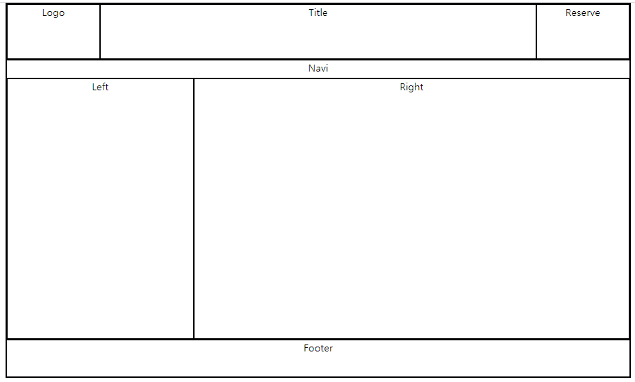
수평 가운데 정렬
line-height : 한줄만쓰는 경우, 높이값이 동적이지 않고 px값인 경우
           .title{
                width: 70%;
                line-height: 90px;
            }
margin 여백
margin : auto는 수평만 적용 (위아래로는 길이가 무한이므로 적용되지 않음)
<!DOCTYPE html>
<html lang="en">
<head>
    <meta charset="UTF-8">
    <title>Document</title>
    <style>
        *{box-sizing: border-box;}
        div{border:1px solid black;}
        .wrapper{
            margin-top: 50px;
            margin: auto;
            width: 200px;
            height: 200px;
        }
        .box{
            width: 100px;
            height: 100px;
        }
    </style>
</head>
<body>
    <div class="wrapper">
        <div class="box">

        </div>
    </div>
</body>
</html>
overflow 속성
내용물이 자신의 영역을 벗어날때 조치할 방법을 정해주기
overflow: hidden
벗어난 내용을 숨겨라
-> 해키한 용법 : 자신의 높이를 벗어났지만 보여짐
<!DOCTYPE html>
<html lang="en">
<head>
    <meta charset="UTF-8">
    <title>Document</title>
    <style>
        *{
            box-sizing: border-box;
        }
        .navi{
            border: 1px solid black;
            overflow: hidden;
        }
        .navi>li{
            float:left;
            border: 1px solid red;
            list-style: none;
            width:25%;
        }
    </style>
</head>
<body>

    <ul class="navi">
       <li>Home</li>
       <li>AboutUs</li>
       <li>Portfolio</li>
       <li>Contact</li>
    </ul>

</body>
</html>

옆에 공백이 생긴 이유?
1) Home의 left마진 -> 다른 li태그 들에는 같은 문제 없음
2) 바깥 element가 내부에 padding을 넣어준 경우
<!DOCTYPE html>
<html lang="en">
<head>
    <meta charset="UTF-8">
    <title>Document</title>
    <style>
        *{
            box-sizing: border-box;
        }
        .navi{
            border: 1px solid black;
            overflow: hidden;
            padding: 0px;
        }
        .navi>li{
            float:left;
            border: 1px solid red;
            list-style: none;
            width:25%;
        }
    </style>
</head>
<body>

    <ul class="navi">
       <li>Home</li>
       <li>AboutUs</li>
       <li>Portfolio</li>
       <li>Contact</li>
    </ul>

</body>
</html>
<!DOCTYPE html>
<html lang="en">
<head>
    <meta charset="UTF-8">
    <title>Document</title>
    <style>
        *{
            box-sizing: border-box;
        }
        .navi{
            overflow: hidden;
            padding: 0px;
        }
        .navi>li{
            float:left;
            list-style: none;
            width:25%;
            text-align: center;
            background-color: black;
        }
        .navi>li>a{
            color: white;
            text-decoration: none;
        }
        .navi>li:hover{
            background-color: dimgray;
        }
    </style>
</head>
<body>

    <ul class="navi">
       <li><a href="#">Home</a></li>
       <li><a href="#">AboutUs</a></li>
       <li><a href="#">Portfolio</a></li>
       <li><a href="#">Contact</a></li>
    </ul>

</body>
</html>
텍스트가 들어있는 칸도 클릭 가능하도록 변결
<!DOCTYPE html>
<html lang="en">
    <head>
        <meta charset="UTF-8">
        <title>Document</title>
        <style>
            *{
                box-sizing: border-box;
            }
            .navi{
                overflow: hidden;
                padding: 0px;
            }
            .navi>li{
                float:left;
                list-style: none;
                width:25%;
                text-align: center;
                background-color: black;
            }
            .navi>li>a{
                color: white;
                text-decoration: none;
                border: 1px solid red;
                /*width: 100%;*/
                /*인라인 속성이라 넓이 조절 불가*/
                display: block
            }
            .navi>li:hover{
                background-color: dimgray;
            }
        </style>
    </head>
    <body>

        <ul class="navi">
            <li><a href="#">Home</a></li>
            <li><a href="#">AboutUs</a></li>
            <li><a href="#">Portfolio</a></li>
            <li><a href="#">Contact</a></li>
        </ul>

    </body>
</html>
기존 예제에 .navi 넣기
<!DOCTYPE html>
<html lang="en">
    <head>
        <meta charset="UTF-8">
        <title>Document</title>
        <style>
            *{
                box-sizing: border-box;
                margin: auto;
                text-align: center;
                padding: 0px;
                /*                overflow: hidden;*/
            }
            div{
                border: 1px solid black;
            }
            .wrapper{
                width: 1000px;
                height: 600px;
            }
            .header{height: 15%;}
            .naviline{height: 5%;}

            .navi{
                height: 100%;


            }

            .contents{height: 70%;}

            .footer{
                height: 10%;
            }
            .left{
                width: 70%;
            }
            .right{
                width: 30%;
            }
            .header>.layout{
                height: 100%;
                float: left;
            }
            .logo{width: 15%;}
            .title{
                width: 70%;
                line-height: 90px;
            }
            .reserve{width: 15%;}
            .contents>.layout{
                height: 100%;
                float: left;
            }
            .navi>li{
                float:left;
                list-style: none;
                width:25%;
                text-align: center;
                background-color: black;
                line-height: 28px;
/*                px 말고 %로는?*/
            }
            .navi>li>a{
                color: white;
                text-decoration: none;
                /*width: 100%;*/
                /*인라인 속성이라 넓이 조절 불가*/
                display: block;


            }
            .navi>li:hover{
                background-color: dimgray;
            }
        </style>
    </head>
    <body>
        <div class="wrapper">
            <div class="header">
                <div class="logo layout">Logo</div>
                <div class="title layout">Title</div>
                <div class="reserve layout">Reserved</div>
            </div>
            <div class="naviline">
                <ul class="navi">
                    <li><a href="#">Home</a></li>
                    <li><a href="#">AboutUs</a></li>
                    <li><a href="#">Portfolio</a></li>
                    <li><a href="#">Contact</a></li>
                </ul>
            </div>
            <div class="contents">
                <div class="left layout">Left</div>
                <div class="right layout">Right</div>
            </div>

            <div class="footer">Footer
            </div>

        </div>

    </body>
</html>
로그인 박스
<!DOCTYPE html>
<html lang="en">
    <head>
        <meta charset="UTF-8">
        <title>Document</title>
        <style>
            *{
                box-sizing: border-box;
                margin: auto;
            }
            .wrapper{
                height: 50px;
                width: 150px;
                border : 1px solid black;
            }
            .idpw{
                float: left;
                height: 100%;
                width:65%;
            }

            .idpw>.idbox{
                height: 50%;
            }
            .idpw>.pwbox{
                height: 50%;
            }

            .id{
                width:100%;
                height: 100%;
            }
            .pw{
                width:100%;
                height: 100%;
            }
            .login{

                border : 1px solid black;
                float: left;
                width:35%;
                height: 100%;
                padding: 8px 8px;
            }
            .button{
                border: none;
                background-color: black;
                color: white;
                border-radius: 5px;
                padding: 10px 5px;
                font-size: 10px;
            }

        </style>
    </head>
    <body>
        <div class="wrapper">

            <div class="idpw">
                <div class="idbox">
                    <input type="text" class="id">
                </div>
                <div class="pwbox">
                    <input type="password" class="pw">
                </div>
            </div>

            <div class="login">
                <input type="button" value="Login" class="button">
            </div>
        </div>

    </body>
</html>
<!DOCTYPE html>
<html lang="en">
    <head>
        <meta charset="UTF-8">
        <title>Document</title>
        <style>
            *{
                box-sizing: border-box;
                margin: auto;
                text-align: center;
                padding: 0px;
            }
            div{
/*                border: 1px solid black;*/
            }
            .wrapper{
                width: 1000px;
                height: 600px;
            }
            .header{height: 15%;}
            .naviline{height: 5%;}
            .navi{
                height: 100%;
            }
            .contents{height: 70%;}

            .footer{
                height: 10%;
                border-bottom: 1px solid black;
                border-top: 1px solid black;
            }
            .left{
                width: 70%;
            }
            .right{
                width: 30%;
            }
            .header>.layout{
                height: 100%;
                float: left;
            }
            .logo{width: 15%;}
            .title{
                width: 70%;
                line-height: 90px;
            }
            .reserve{width: 15%;}
            .contents>.layout{
                height: 100%;
                float: left;
            }
            .navi>li{
                float:left;
                list-style: none;
                width:25%;
                text-align: center;
                background-color: black;
                line-height: 28px;
                /*                px 말고 %로는?*/
            }
            .navi>li>a{
                color: white;
                text-decoration: none;
                /*width: 100%;*/
                /*인라인 속성이라 넓이 조절 불가*/
                display: block;


            }
            .navi>li:hover{
                background-color: dimgray;
            }
            .idpw{
                float: left;
                height: 100%;
                width:65%;
            }

            .idpw>.idbox{
                height: 50%;
            }
            .idpw>.pwbox{
                height: 50%;
            }

            .id{
                width:100%;
                height: 100%;
                font-size: 100%;
                border: none;
                border-bottom: 1px solid black;
            }
            .pw{
                width:100%;
                height: 100%;
                font-size: 100%;
                border: none;
                border-bottom: 1px solid black;
            }
            .login{

                float: left;
                width:35%;
                height: 100%;
                padding: 8px 8px;
            }
            .button{
                border: 1px solid black;
                background-color: white;
                color: black;
                border-radius: 5px;
                padding: 8px 15px;
                font-size: 15px;
            }
            .loginbox{

                width: 100%;
                height: 50px;
            }
            .banner{

                padding: 150px
            }

        </style>
    </head>
    <body>
        <div class="wrapper">
            <div class="header">
                <div class="logo layout">Logo</div>
                <div class="title layout">
                  <img src="car2.jpg" width=100%  height=100%>
                </div>
                <div class="reserve layout">Reserved</div>
            </div>
            <div class="naviline">
                <ul class="navi">
                    <li><a href="#">Home</a></li>
                    <li><a href="#">AboutUs</a></li>
                    <li><a href="#">Portfolio</a></li>
                    <li><a href="#">Contact</a></li>
                </ul>
            </div>
            <div class="contents">
                <div class="left layout">Left</div>
                <div class="right layout">
                    <div class="loginbox">
                        <div class="idpw">
                            <div class="idbox">
                                <input type="text" class="id" placeholder="ID를 입력하세요">
                            </div>
                            <div class="pwbox">
                                <input type="password" class="pw" placeholder="PW를 입력하세요">
                            </div>
                        </div>

                        <div class="login">
                            <input type="button" value="Login" class="button">
                        </div>
                    </div>
                    <div class="banner">
                        banner
                    </div>
                </div>
            </div>

            <div class="footer">Footer
            </div>

        </div>

    </body>
</html>
'디지털 컨버전스 > HTML&CSS' 카테고리의 다른 글
| [CSS] Positioning - position: relative (0) | 2020.04.07 |
|---|---|
| [CSS] overflow-y: auto (0) | 2020.04.07 |
| [CSS] Internal Style, External Style, 선택자 (0) | 2020.04.03 |
| [HTML] form (0) | 2020.04.03 |
| [HTML] Web-FrontEnd (0) | 2020.04.01 |