<!DOCTYPE html>
<html lang="en">
<head>
    <meta charset="UTF-8">
    <title>Document</title>
    <style>
        *{box-sizing: border-box;}
        div{border: 1px solid black;}
        .wrapper{
            width: 300px;
            height: 300px;
            margin: auto;
            position: relative;
        }
        .box1{
            width:100px;
            height: 100px;
            position: absolute;
            top: 50px;
            left: 50px;
            background-color: pink;
        }
        .box2{
            width:100px;
            height: 100px;
            position: absolute;
            top: 100px;
            left: 100px;
            background-color: dodgerblue;
        }

    </style>
</head>
<body>
    <div class="wrapper">
        <div class="box1">
        </div>
        <div class="box2">
        </div>
    </div>
</body>
</html>
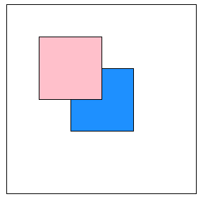
위로 올라오는 순서 바꾸기
1) 태그위치 바꾸기
2) z-index
z축은 앞뒤를 가르킴
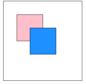
        .box1{
            width:100px;
            height: 100px;
            position: absolute;
            top: 50px;
            left: 50px;
            background-color: pink;
            z-index: 1;
        }
        .box1{
            width:100px;
            height: 100px;
            position: absolute;
            top: 50px;
            left: 50px;
            background-color: pink;
            z-index: 1;
        }
        .box2{
            width:100px;
            height: 100px;
            position: absolute;
            top: 100px;
            left: 100px;
            background-color: dodgerblue;
            z-index: 5;
        }
margin을 사용하는 경우 주변이 밀리는 듯한 효과
positioning을 사용하면 개별적으로
'디지털 컨버전스 > HTML&CSS' 카테고리의 다른 글
| [CSS] 예제 (z-index , position) - 겹친사진, 사이드바 (0) | 2020.04.07 |
|---|---|
| [CSS] Positioning - position: fixed (0) | 2020.04.07 |
| [CSS] Positioning - position: absolute (0) | 2020.04.07 |
| [CSS] Positioning - position: relative (0) | 2020.04.07 |
| [CSS] overflow-y: auto (0) | 2020.04.07 |